PURPLE MATTRESS
Improving the returns process to regain trust with Purple customers
Role: UX Designer
Team: Post-Purchase team
Platform: iOS & Android
While at Purple, I was a floating UX designer and my projects spanned across the entire user journey - from first landing on the Purple page, to adding to cart, to making returns. I also worked on the Pre-Purchase product group, responsible for the customer experience on Purple.com from landing all the way up to “adding to cart”.

Product overview
Purple is an online mattress retailer known for its unique Gelflex Grid design. We create better-than-best sleep solutions that help everybody feel and live better.
My role
While at Purple, I was a floating UX designer and my projects spanned across the entire user journey - from first landing on the Purple page, to adding to cart, to making returns. I also worked specifically on the Pre-Purchase product group, responsible for the customer experience on Purple.com from landing all the way up to “adding to cart”.
Primary work
My main efforts were around concepting, designing, and user testing high-visibility pages such as our category pages, PDPs, and blog pages. When I joined Purple, we were in the middle of a huge rebrand, so many of my projects have been around redesigning our Product Detail Pages (PDPs) and stories to match our new style and brand.
To view live website work, visit:
The Problem
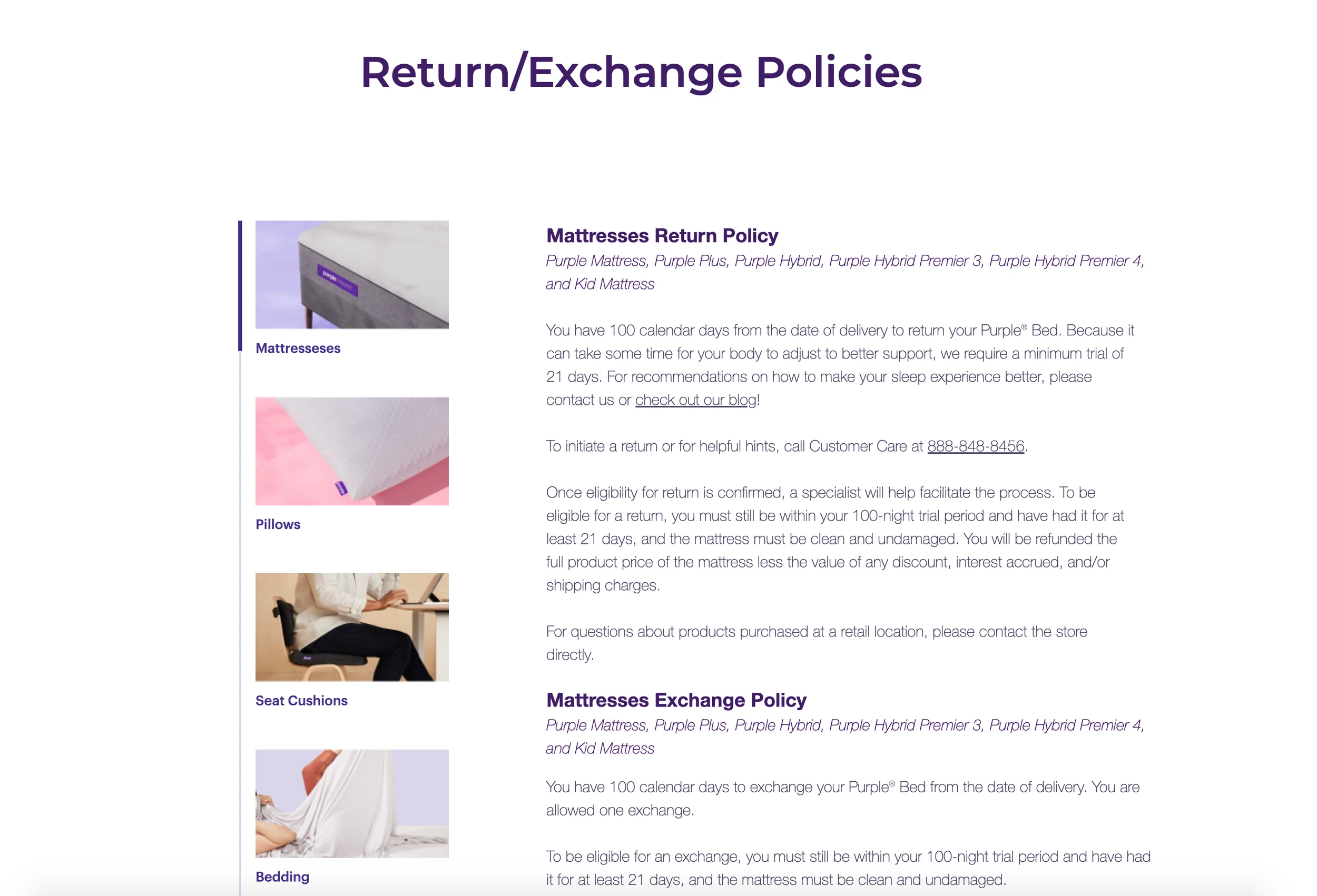
Returning items purchased from Purple.com is a pain - customers need to call or email in order to set up a return for all Purple items. We found that we were losing trust in our customers by hiding the return process and designing the experience to be cumbersome and slow. While as an e-commerce business our main goal is to make sales, we also want to retain our customers and build trust and loyalty with our brand. By hiding our return process and forcing customers to call or email in order to set up returns, we were causing extra pain. This applied to all Purple products, whether it was a large, expensive mattress or smaller items such as sheets and pillows.
How might we make returning accessory items under a 30 day return period easier and accessible?
Method
Our returns page had many inconsistencies and issues beginning with the user journey to even reach the returns page, and then actually initiating a return. Many of our user complaints centered around lack of customer service and information on how to return products - some of which cost no small sum of money. The request from our stakeholders was to make returning items that fall under a 30 day return period easier to return without calling or emailing customer service.
I began by auditing our returns page to understand the information architecture and flow for actually returning an item. I frequently met with Purple customer service representatives to understand generally why our customers were wanting to return an item, and what sort of conversations they usually had. I also compared our returns page against competitors such as Casper and Saatva.
I noticed several online eCommerce companies utilized iFrames to initiate returns online - a simple survey that usually just asked for basic information such as the user’s name, email, order number, and why they were returning the item. I connected with the customer insights and research team at Purple and used their help to interview 3 users and get their perceptions of online returns and what they generally liked to see. I also referenced Baymard and several UX blogs for return flows. After presenting findings to stakeholders, we decided to hold off on redesigning the entire returns page for the time being, but to instead focus on creating an online returns survey for 30 day returns which would include bedding, pillows, and other smaller Purple accessories.
Using all of the information I gathered, I spoke with the CI team and we landed on using a Qualtrics survey in an iFrame for our online return. I began by designing the entire flow of the survey - the headlines, questions, required fields, etc. In this step, I worked closely with my product manager on what to focus on and how to flow the information architecture. The information architecture was a huge portion that had to be addressed before prototyping. I went through multiple user flows of returns and consistently referenced online return surveys.
When the flow was determined, I began wireframing out the survey. Since this was ultimately going to be designed in Qualtrics, I understood there would be some UI limitations so I designed within those constraints to the best of my ability. This mostly just affected small things such as button sizes and fonts, rather than the actual flow of the survey. I then prototyped out the survey and tested the survey in Figma with 7 participants.
After wrapping up user testing, I handed off my Figma file to a developer who coded the entire survey. While we do have a QA team, I also aided in double checking the code, testing the survey multiple times and checking against my Figma to make sure it was accurate to how it was designed.
Outcome
The 30 day returns survey is now being launched and we are already receiving online returns this way. While ultimately no eCommerce site wants to have to process returns, we also don’t want it to be a headache for our customers and cause even more friction. I’m happy to report the survey works exactly as intended, and has been backed by multiple rounds of research and user testing.
Because this work is owned by Purple, I can only show what is live on site. I can't show mockups, research reports, or prototypes, but know that I took care to apply each step of the UX process to this project.
To view the returns survey, click here:
Returns Page: Before


Returns Page: After