The design process for the Frontier Airlines mobile application, from building the systems to full rollout
Overview
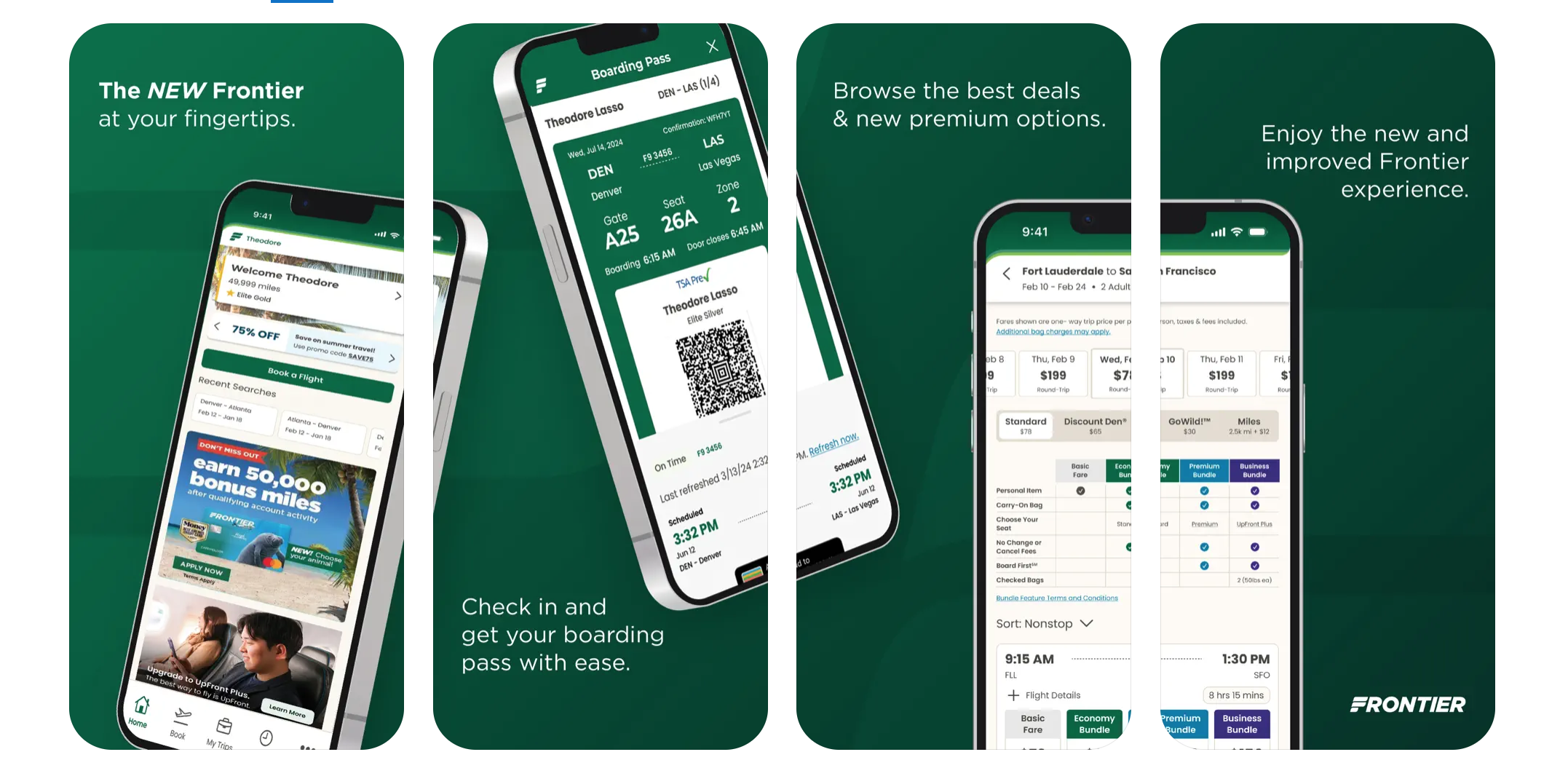
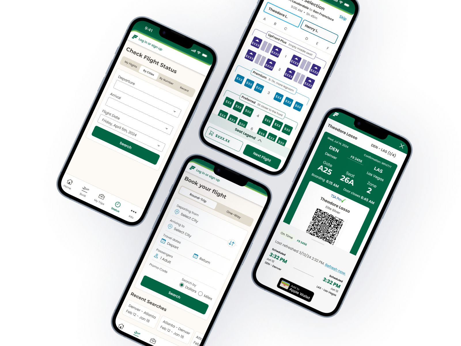
As Lead UX Designer at Frontier Airlines, I led the design and rollout of the new Frontier mobile application, released to 100% of Android and iOS users in May 2025. This effort was part of a broader initiative called the New Commercial Platform (NCP), which aimed to modernize both our web and mobile experiences. The new app features a completely redesigned interface, improved performance, and key new functionalities such as GoWild Pass booking, enhanced check-in flows, and simplified digital boarding passes.
Role: Lead UX Designer
Team: Small in-house design team
Platform: iOS & Android
Timeline: 2 Years from Ideation to Release; 4 Month Design System
(Some) of My Responsibilities:
Led overall UX direction for the new mobile application + website
Designed and implemented a mobile-first design system
Facilitated bi-weekly reviews with executive leadership (VP of Product, CCO)
Collaborated with product and engineering under a compressed timeline
Context
When I joined Frontier in October 2023 as a Senior UX Designer, I was initially tasked with supporting the redesign of our legacy web experience. We had a separate team dedicated to the mobile side.
At the time, our mobile application was fully owned and operated by a third-party vendor, and its performance and functionality were lackluster, with frequent bugs, limited features, and growing frustration from both our customers and our internal teams. Our initiative was to bring the entire production in-house, completely designed, built, and launched by the Frontier team.
The UX redesign of the mobile app was scheduled on our roadmap to be completed by February 2025. However, due to shifting priorities, we were given a new deadline: June 2024. This sudden acceleration led to an immediate pivot in focus from all other platforms (web and legacy) to our new mobile app across the entire UX team. However, to tackle this unexpected change, we needed to address many other key issues beforehand, including our lack of a design system and cohesiveness among the designers.
Challenges
Aggressive Timelines: Our design window was reduced by more than half.
Team Restructuring: Over time, we experienced significant attrition, leaving a small team of four to execute the full app redesign.
Lack of Infrastructure: No existing design system, inconsistent UI, and no in-house mobile design precedent.
Leadership Gaps: We operated without a direct UX manager, reporting instead to a high-level director.
Executive Alignment
Throughout the design process, I maintained regular communication with senior leadership. I presented our progress in bi-weekly reviews to the VP of Product and our Chief Commercial Officer. This visibility helped align our product strategy with broader business goals and ensured continuous executive buy-in.
User Insights & Auditing the Third-Party Application
Before our accelerated timeline, we had dedicated a large portion of our time to grounding our work in real-world needs. This included:
Conducting surveys with active Frontier flyers
Interviewing travelers at DEN (the Denver hub)
Audited customer service logs to identify friction points
Top pain points surfaced:
Lack of price transparency
Inability to book GoWild Pass flights on mobile
Confusing upsells and unclear add-on pricing
Accessibility was dropped in several areas (color, typography, interactions, etc)
These insights shaped our priorities. We focused on building trust through transparency, streamlining booking flows, and ensuring GoWild functionality was front and center.
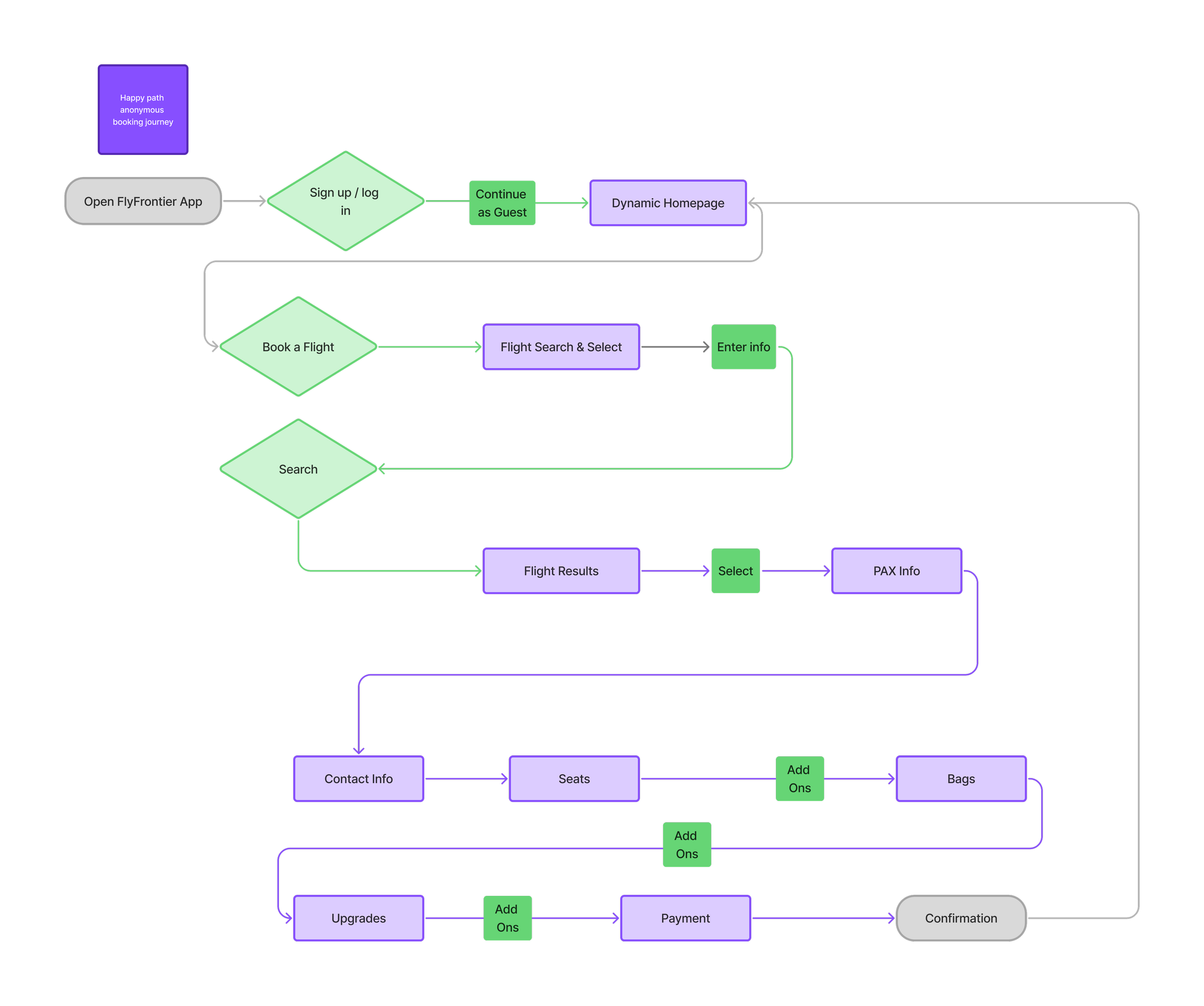
We based many of our user journeys and flows on the third-party Frontier application, and audited key errors such as accessibility and key missing features our customer base was asking for.
Walking Before We Run: Establishing the Foundation
The first major hurdle was the absence of a design system. Because we were already mid-flight (pun intended) with our project, but without a unified way of working, we first addressed building that. Our team knew that in order to hit our timeline goal, we would have to go slower at first to work faster later. Without consistency in UI components, we were losing time and quality. In January 2024, I initiated and led the development of our mobile-first design system.
Within three months, we delivered a fully functioning library of reusable components and styles. This system became the foundation for all future screens and ensured cohesion across contributors. We then retroactively translated previously completed work into the new system and applied it moving forward to all in-progress designs. Within a few months of finalizing the design system, I was promoted to Lead UX Designer.
My design system case study is still a work in progress, and the page is currently disabled. I aim to have this live in a few weeks. Thank you for your patience!
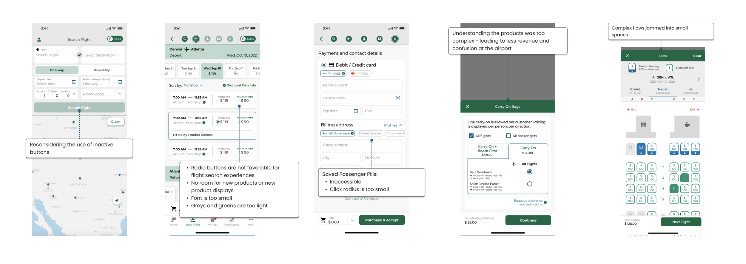
Before: Inconsistent branding, mismatched patterns, and lots of confusion
From our audits of our current work, we noticed several inconsistencies page-to-page within the same journey, and from designer to designer. There was no cohesive typography, fonts, or components. Nothing was componentized, and our work was slow and confusing, often times many conversations involved “Wait, that’s not what that button looks like on my page…”
Disjointed screens led to a lack of cohesiveness and a slow, confusing workflow.
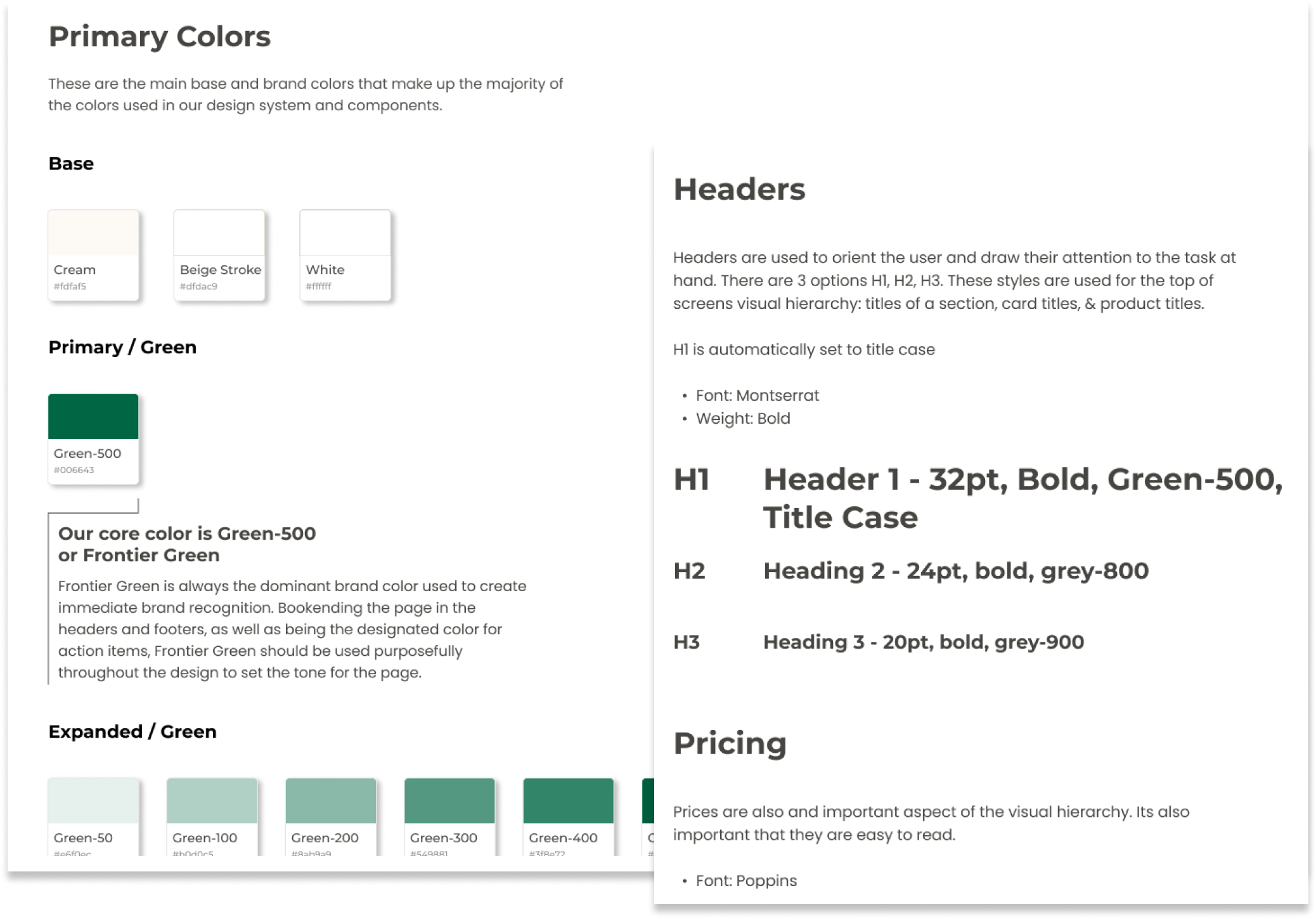
Once our design system (which we affectionately refer to as Co-Pilot) was in a place where it had the primary components needed to build out our pages, we applied them to current designs and continued to add to Co-Pilot on an as-needed basis.
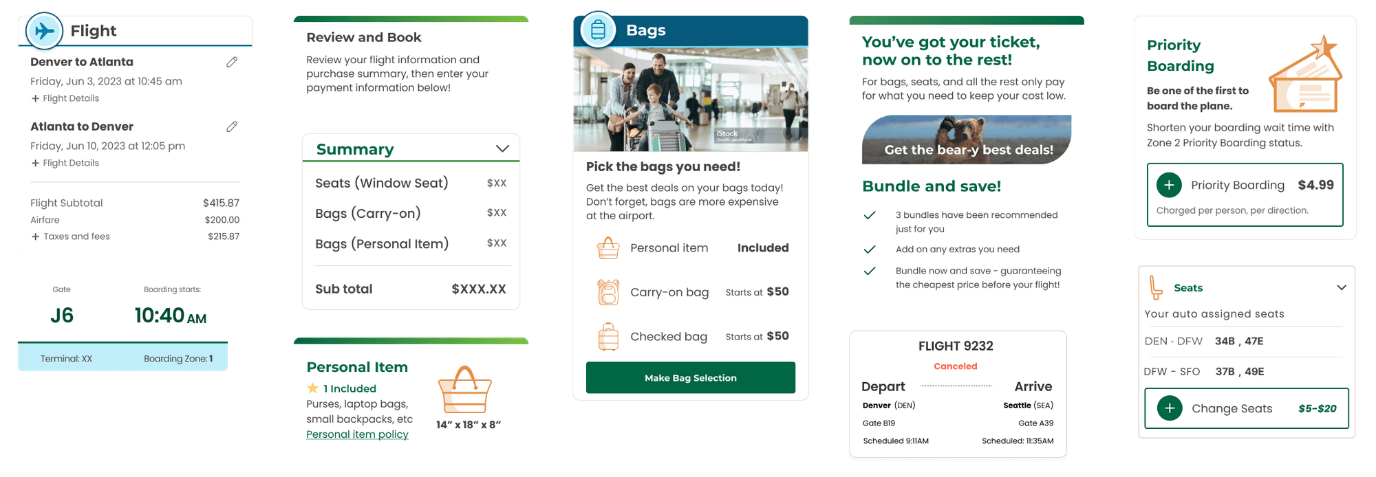
After: We applied the design system to existing pages, and continued to add components and rules based off what was missing
With the application of Co-Pilot, our work was quicker and UI decisions were made at the component level
Once our design system basics were established, we were able to quickly return to our designs and apply these components to those pages. Despite still going through multiple iterations of these pages and flows to land on our MVP released app, our iterations went by much quicker.
Turning back to our primary task, we assigned ownership of sections of the mobile app by journey, allowing each designer to go deep on their area while maintaining cohesion through regular team syncs and the shared design system.
Team Strategy: Dividing the app into journeys
Booking Flow
This journey followed the user from searching for a flight all the way through the booking process and ending with purchasing.
Post Booking
Once a flight is booked, the user’s needs access to manage or change their trip.
Account & Loyalty
For all our customers to access their profiles, settings, and other features on the app. Includes loyalty member flows.
Day of Travel
Customers who are checking in, acquiring boarding passes, or checking flight status.
A Deep Dive into the Booking Flow
The most important user journeys to our Frontier customers were the booking flow and the check-in journey. While I got the opportunity to work on every journey, I focused most on the mobile booking flow, and later the web booking flow.
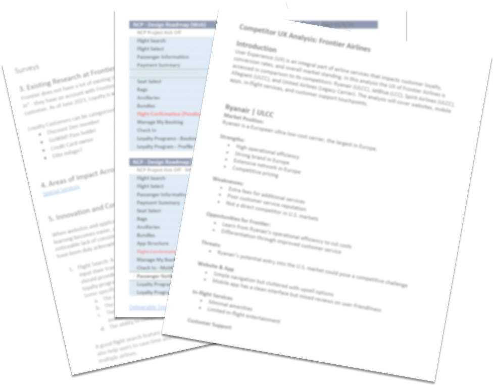
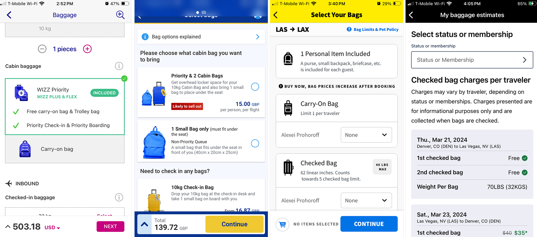
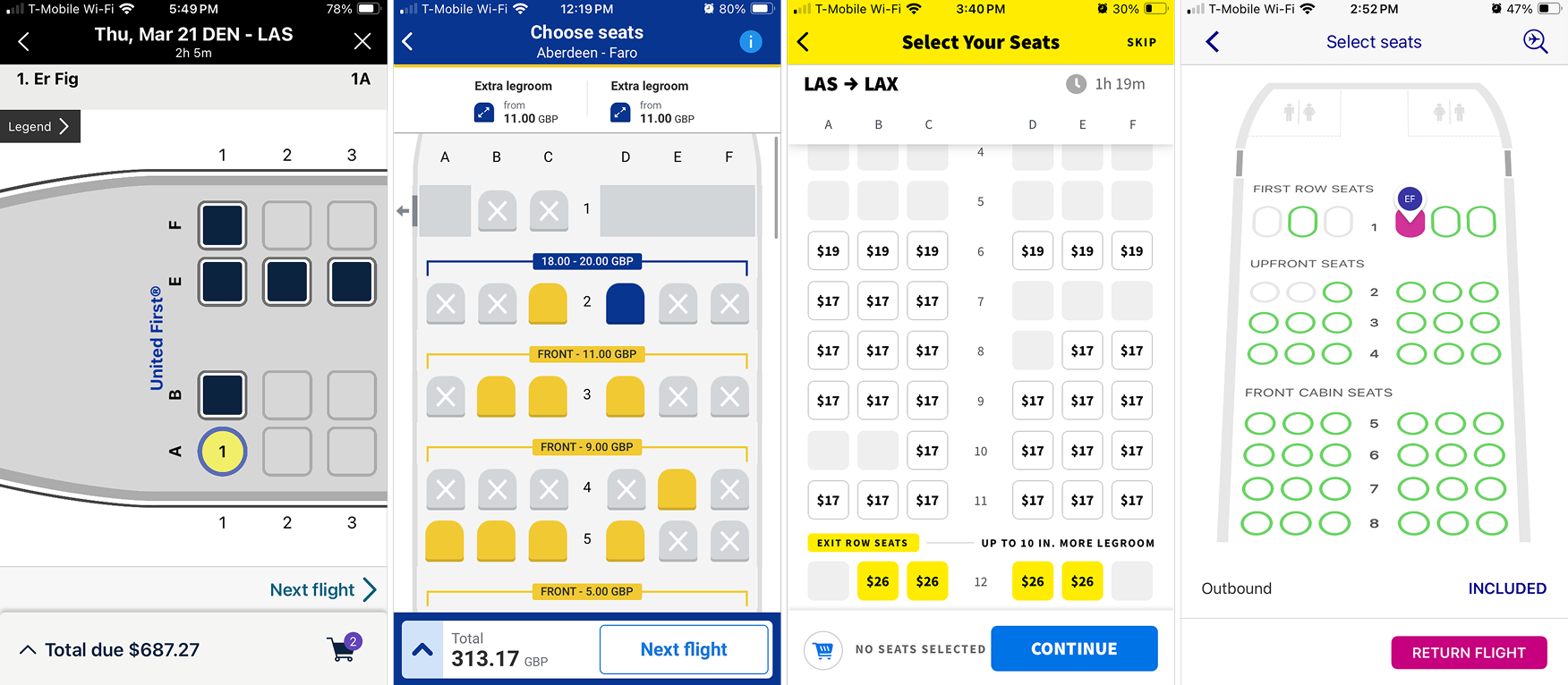
A major part of our process was constant competitive analysis. Airline websites and applications change daily, and it was a race to keep up with new features that our executive team wanted included in the roadmap based off what others were doing.
We broke the booking flow down page by page, looking closely at how each UI element worked in context. Our stakeholders were especially interested in how other airlines presented and represented their products, right down to the smallest details. We had a running Figma file that compiled hundreds of screenshots of websites (both desktop and responsive sizes) and applications of airlines, documenting every process from booking, to check-in, canceling, and everything in between.
Note: These are some of the oldest screenshots we have, and they do not represent the full range of airlines we have examined overall.
Airlines change constantly and competitive analysis happened daily
Seats
Bags
Mapping out real traveler needs
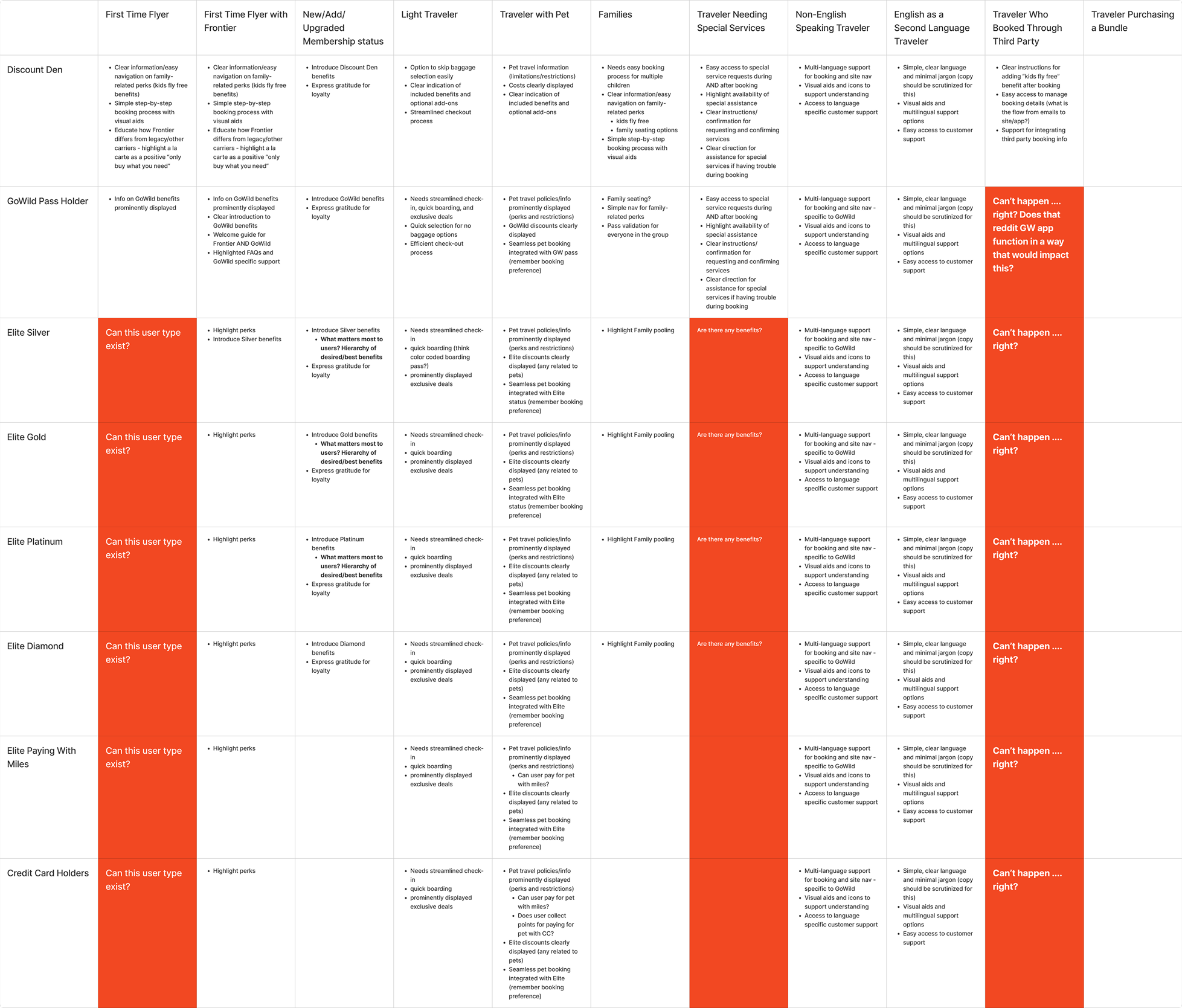
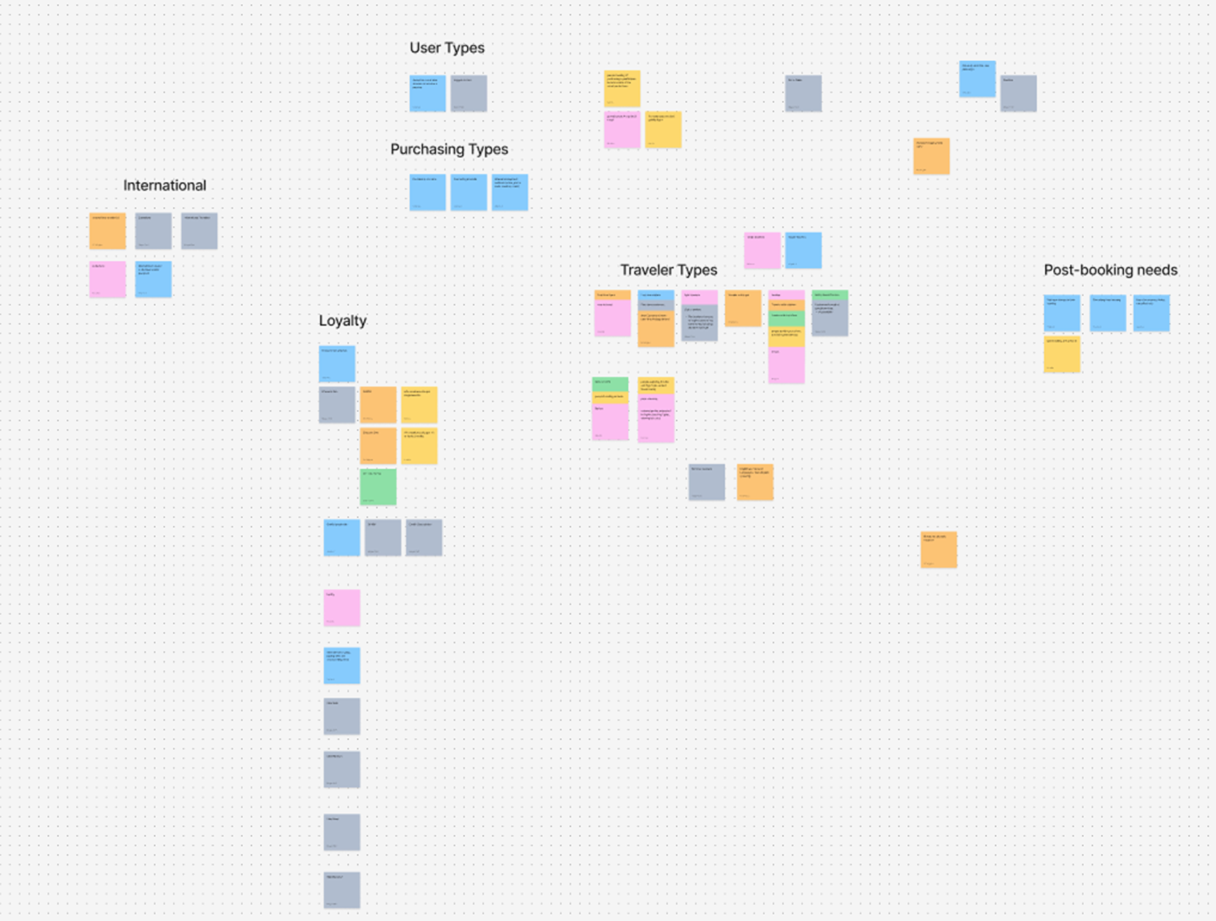
To better understand the full range of Frontier customers, our team ran a series of collaborative FigJam mapping sessions. We explored a wide spectrum of traveler behaviors, mindsets, and habits. We captured everyone from frequent flyers to first-timers.
We mapped distinctions such as:
• Travelers who pack light vs. those who pack heavier
• First-time flyers vs. elite-status loyalty members
• Regular Frontier travelers vs. occasional deal-seekers
• One-time anonymous buyers vs. high-value repeat customers
Once we had a broad, unfiltered view of our audience, we grouped the insights into reference tables. These became a key resource throughout our process, helping us stay grounded in real user needs and pressure-test flows across critical moments, from add-on selection to seat choice.
Iterating, refining, and learning along the way
Like any big redesign, not every idea worked perfectly the first time. We had a tight timeline, and the app was something the entire company cared about. Input came from stakeholders, marketing, and other designers, all at once and often.
Release and Rollout
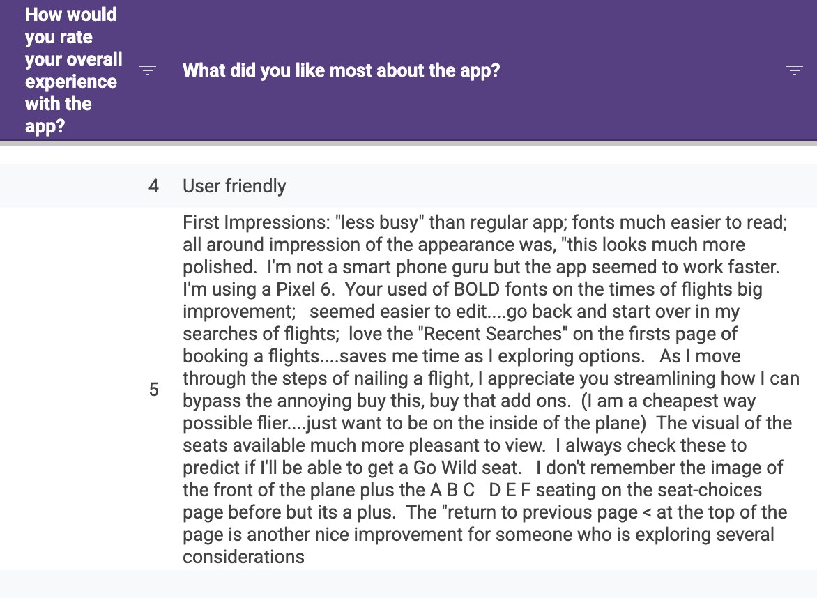
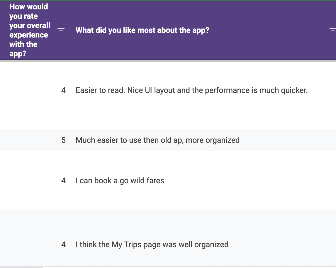
February 2025, we rolled out to loyalty members on Android for beta testing feedback. Over 500 responses mentioned improved UX, UI, and satisfaction with the new app.
While we missed our June 2024 deadline, we successfully handed off most final designs by that summer. QA began in December 2024, followed by:
Jan–Feb 2025: Android beta testing
Mar 2025: Soft rollout to Android users
Apr 2025: iOS testing phase
May 2025: Full public release (v3.0.1)
Impact
Performance:
Significantly faster load times - from over 5 seconds to 2 seconds
Team Growth:
Set the stage for scalable design processes and future hires
Functionality:
Full GoWild Pass integration, seamless check-in, and enhanced profile features
Experience:
Unified look and feel across the app and a focus on user experience
App Satisfaction:
Increase in our average app rating from 4.3/5 to 4.8/5
Shipping a fully redesigned mobile app on an accelerated timeline with a lean team was no small task. This project demanded not just design skills but leadership, strategic thinking, and adaptability. I'm proud of how we transformed Frontier's mobile presence, all while navigating setbacks, ambiguity, and an ever-changing airline landscape.
This was my first major project that I have been a key player in from conception, to definition, designing, iterating, prototyping, and testing to full rollout. In 2024, Frontier serviced over 33 million flyers, a number that was quite daunting to me, knowing a majority of those users relied on our work to get to where they needed to go. I feel a significant amount of pride, and an equal amount of trepidation because I have poured so much time and energy into this initiative. I could not have done it without my incredible team of designers, directors, product owners, engineers, and leadership. Many thanks to everyone involved, and thank you for reading this far. Happy flying!
