FRONTIER AIRLINES
Role: Lead Designer
Team: Small in-house design team
Platform: iOS & Android
Timeline: 4-month design system; ongoing updates following
Due to a tight timeline switch reducing our design-handoff ready date by over 8 months, we had to focus all attention on our mobile application. It was here that we began to realize the intense split in UI between web and mobile, and the absolute need to unify under a single design system. Suddenly, we were in a race not just to redesign everything, but to figure out how to scale our process fast enough to ship it efficiently.
Frontier’s goal was to launch a brand-new mobile and web experience designed and built 100% in-house. The legacy site and mobile app had major usability issues: slow performance, visual inconsistencies, and confusing, difficult navigation.
Internally, we were dealing with a different set of problems: design was split between web and mobile, with no shared design language. Teams were designing in silos, sometimes creating entirely different experiences for the same feature.
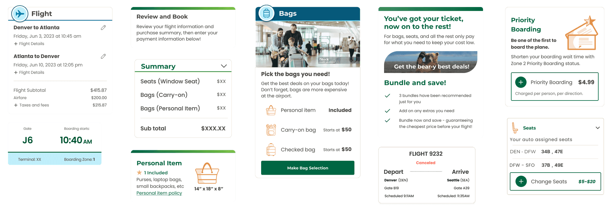
Examples of cards being used on several pages of our application. Each card lacked cohesion and utilized different styles of buttons, colors, icons, etc.
Without a shared design system, we hit walls fast. Teams were duplicating work, reinventing components, and constantly debating visual decisions that should’ve already been solved.
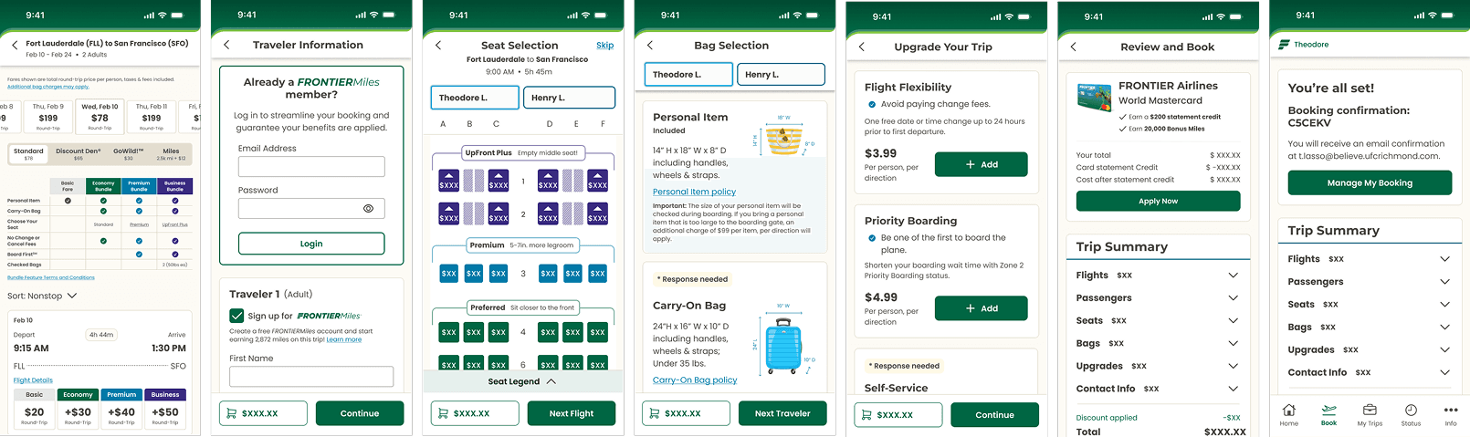
We quickly identified that we needed a foundation to build all NCP designs off of. By unifying the platforms, we would create a more predictable experience between the web and mobile experience.
Leading the Design System
Originally I was hired on as a senior designer for the web team, but due to a tight timeline switch reducing our design-handoff ready date from February 2025 to July 2024, our team of 3 web designers and 4 mobile designers became one team of 7 working on our mobile application. It was here that we began to realize the intense split in UI between web and mobile, and the absolute need to unify under a single design system. Suddenly, we were in a race not just to redesign everything, but to figure out how to scale our process fast enough to ship it efficiently.
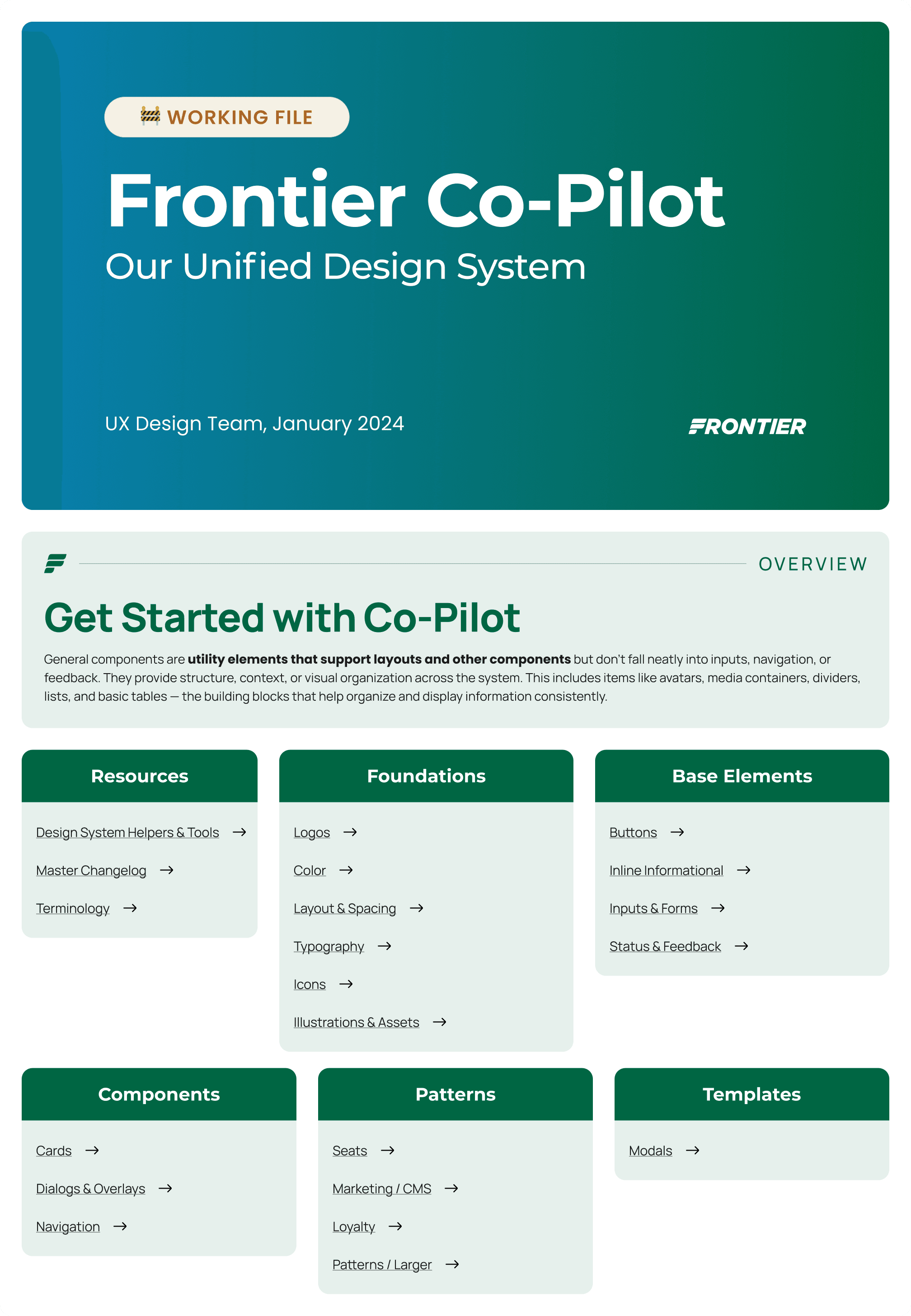
In January 2024, I became the lead for building our unified design system. We had a small window of downtime that had been approved for us to re-evaluate our working ways, and I knew this was our chance to get ahead. Our design system would be the lever that allowed us to design, iterate, and ship faster, without sacrificing quality.
The Approach
Audit the mess. Establish the core foundations. Rapid iteration.
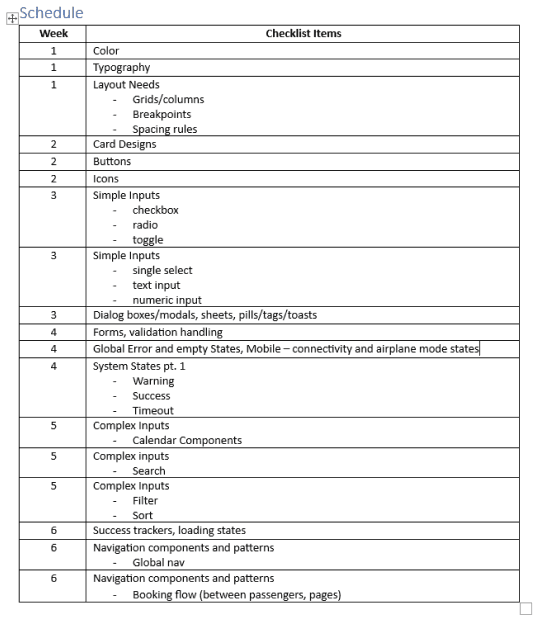
The Schedule
Start with the basics, and add on each week.
We set out to establish a robust design system to standardize elements, streamline workflows, and elevate the user experience.
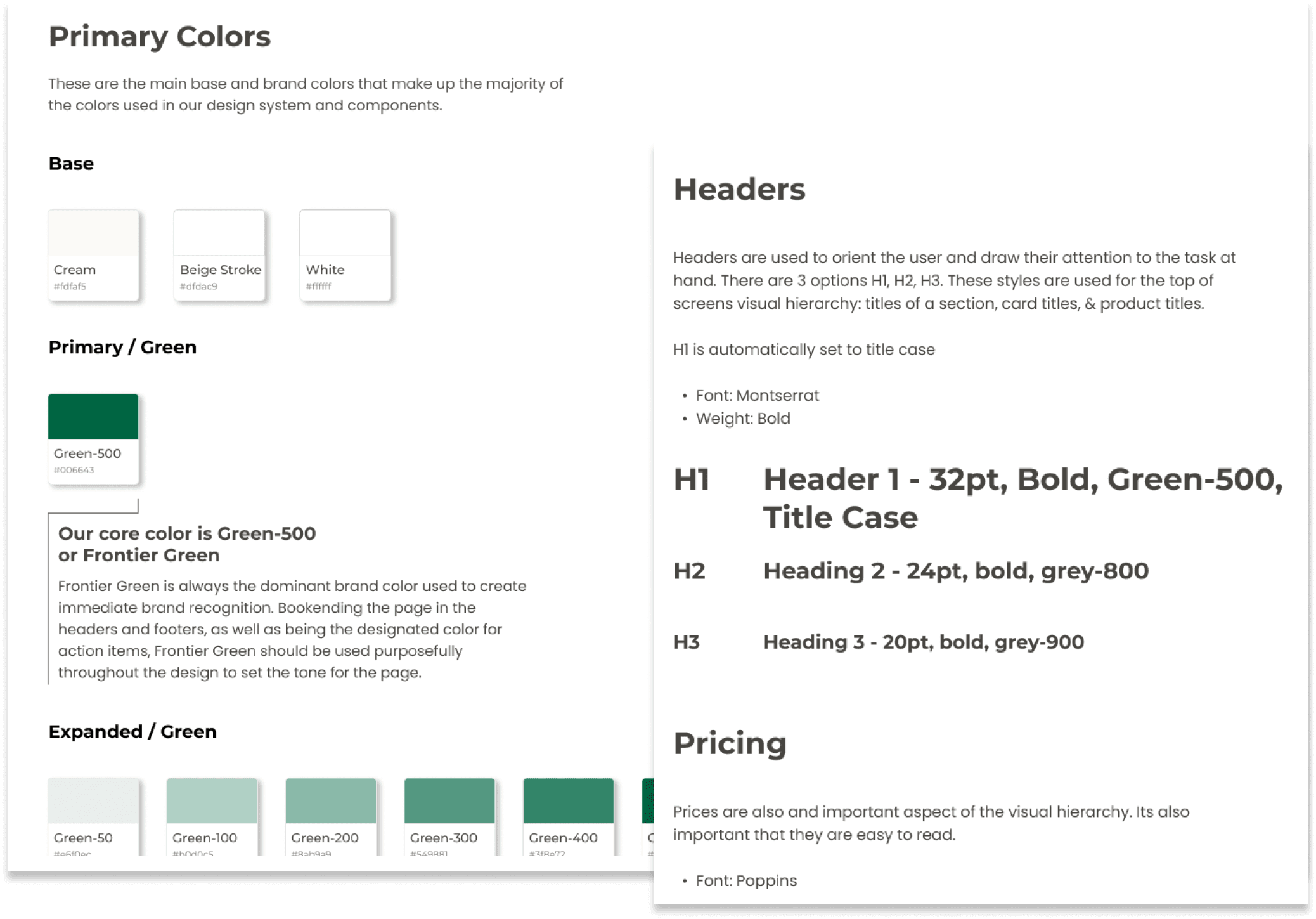
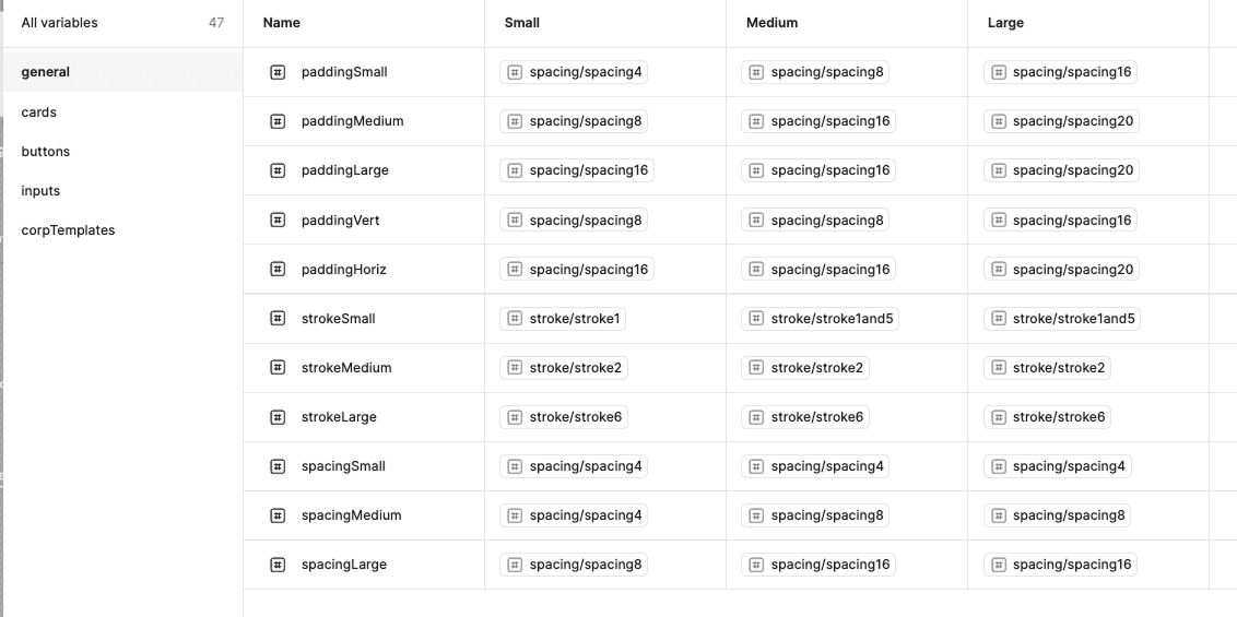
Using Variables for Shared Language
Figma just released variables, which we used to establish a shared basis with development.
Easy to Use
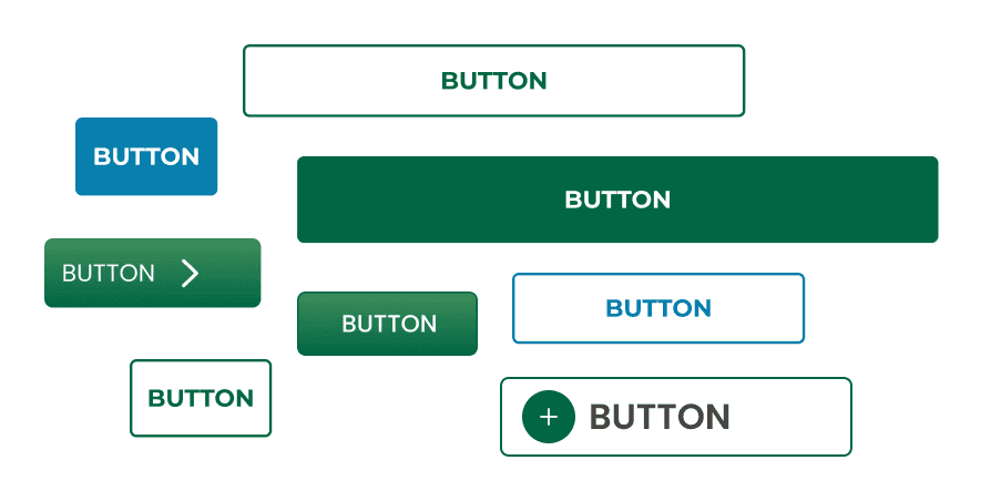
The DS is straightforward and easy to navigate for designers and developers
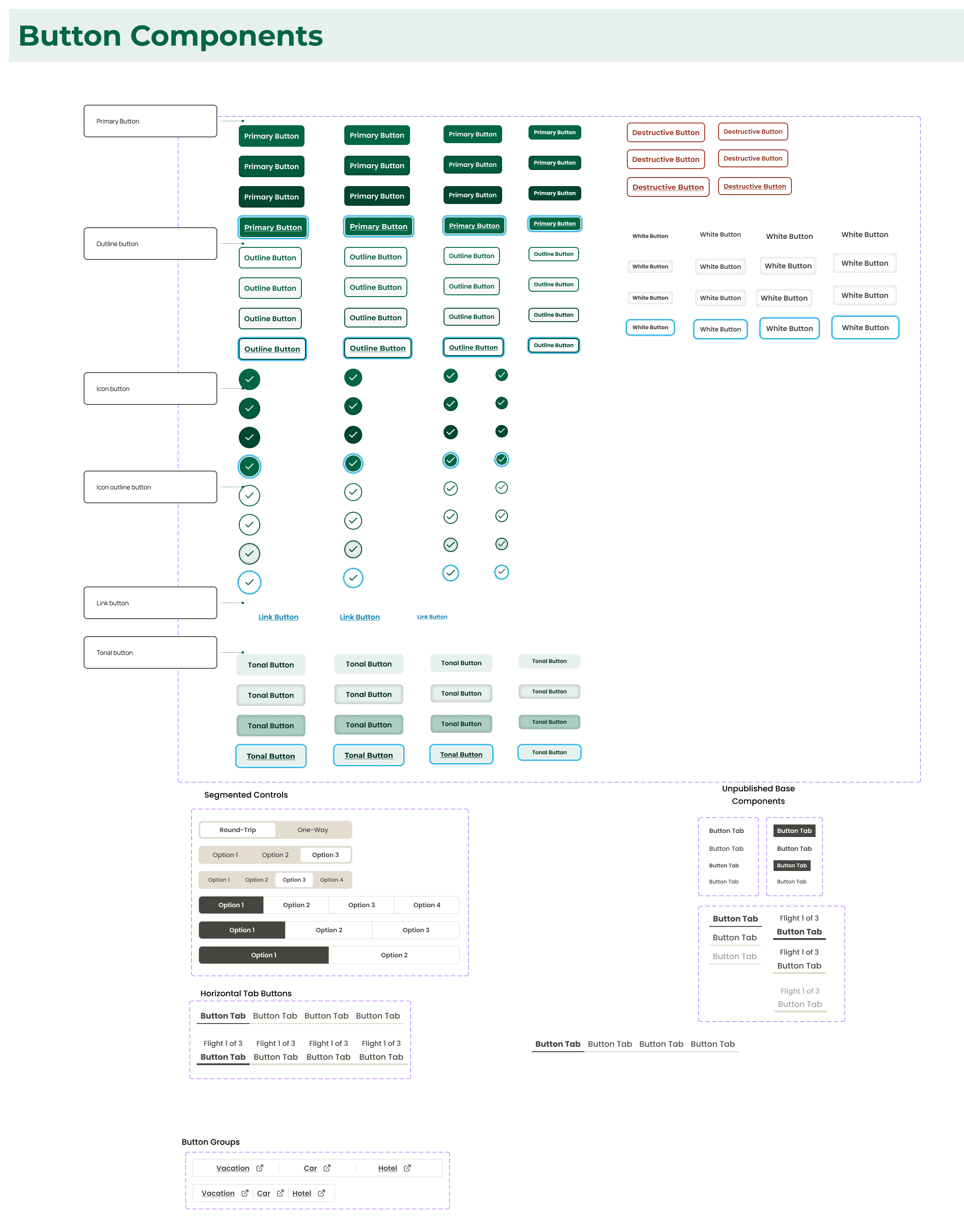
Components are built for many use cases and to span across the application
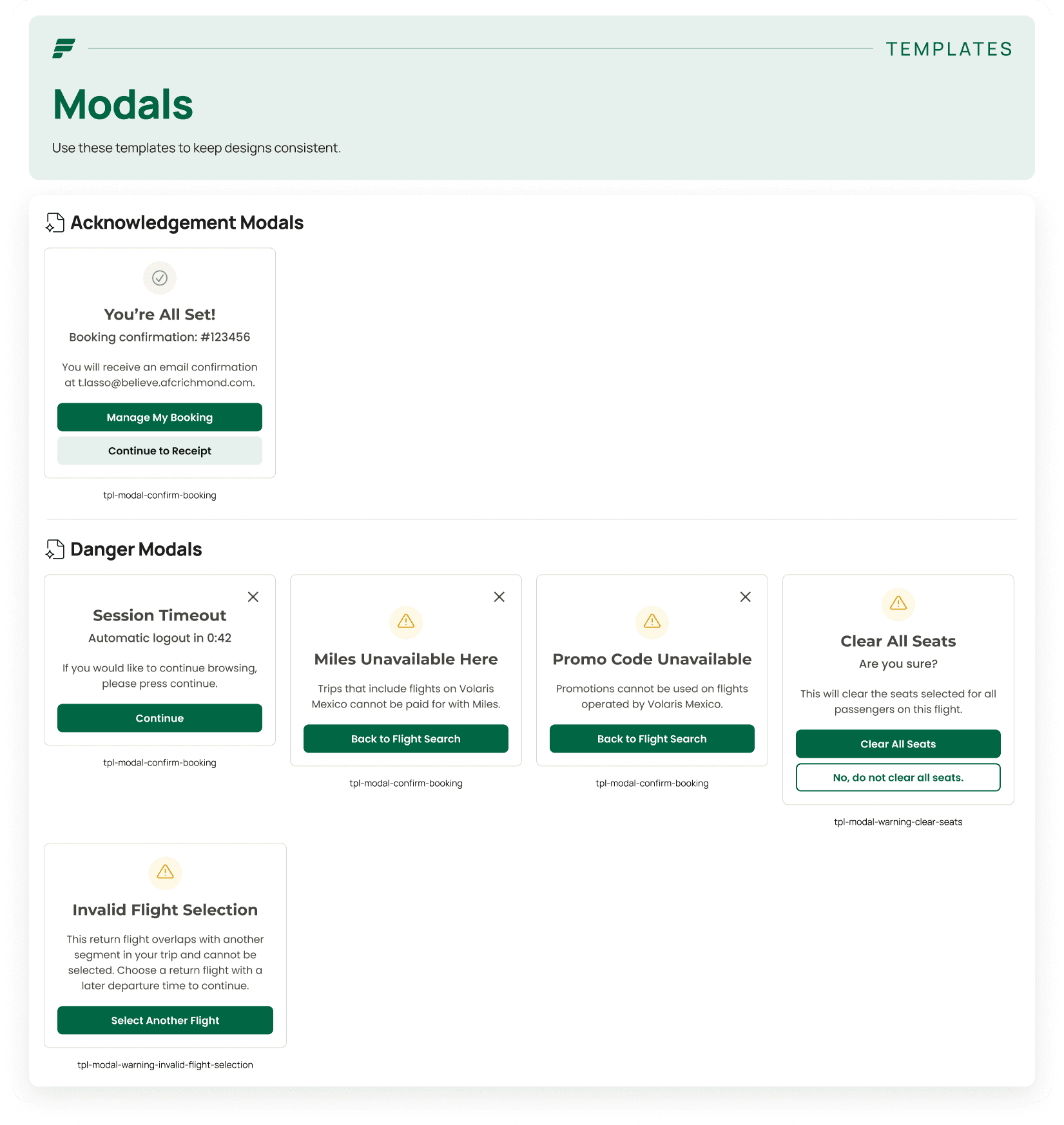
Using base components, templates (such as modals) are easy to use and swap out
A Glimpse at the Design System in Use